📍 Climate Baseline by State
Understand Australia's regional climate patterns. Rainfall, temperature, and evaporation set the stage for fire risk and drought severity.
How to explore
Use the dropdown to switch between rainfall, maximum temperature, and evaporation. Move the year slider to see how conditions change over time.
Lower rainfall + higher temperatures = increased fire risk and drought stress.
🌐 Australia's Carbon Footprint: Global vs Per-Person
While Australia's global share seems modest, our per-capita emissions tell a different story.
The Global Picture
Australia accounts for roughly 1-1.2% of global CO₂ emissions. In isolation, this looks small. But context matters.
Per-Capita Reality
On a per-person basis, Australians emit more CO₂ than citizens of the UK, China, or India—all nations with much larger populations or greater industrialization.
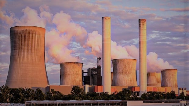
⚙️ What Drives Australia's Emissions?
Coal, oil, gas, cement, and flaring each contribute differently to our carbon output.
Sector Breakdown
The stacked area chart reveals Australia's coal dominance. Coal has historically been the backbone of Australian energy production, though natural gas is growing.
Toggle between absolute (tonnes) and normalized (percentage) views to see both the scale and the mix.
💰 Economic Growth vs Emission Efficiency
Has Australia decoupled GDP growth from carbon emissions?
What the bubble chart shows
X-axis: GDP in billions USD (economic size)
Y-axis: CO₂ per GDP (emission intensity)
Bubble size: Population in millions
The Story
Ideally, we'd see bubbles move right and down over time: GDP growing while emission intensity shrinks. Watch for the trend.
🌡️ Australia's Emissions vs Temperature Impact
The direct relationship between our CO₂ output and the warming we experience.
Reading the Chart
Each dot is a year, colored by time (green = 1850s, red = 2020s). The dashed line shows the linear trend: more emissions, more warming.
The Connection
The positive correlation underscores a hard truth: Australia's rising CO₂ emissions are driving measurable temperature increases, with cascading effects on drought, fires, and ecosystems.
🎯 Key Takeaways
What the data tells us about Australia's climate and carbon journey.
1. Regional Climate Shifts
Rainfall patterns are becoming more erratic; temperatures are rising. Dry years are more common, intensifying fire seasons and water stress.
2. High Per-Capita Emissions
Australia ranks among the highest in per-person CO₂ output, driven by fossil fuel dependence and energy-intensive industries.
3. Coal's Dominance
Despite renewable energy growth, coal remains the largest single source of Australia's emissions, though gas is rising.
4. Partial Decoupling
Australia has improved emission intensity, but absolute emissions haven't declined sharply—economic growth and carbon are still intertwined.
5. Temperature Impact
Our emissions drive local warming, which amplifies fire risk, drought severity, and ecosystem stress.
6. The Path Forward
Transitioning to renewables, improving efficiency, and managing land use are essential to break the emissions-warming cycle.